There is no shame in creating a logo using an app or program when you are first starting as an entrepreneur. Often your start-up starts with bank account $0. And if you don’t even know if you’ll be in business in a year, why invest money only to lose money?
What happens, however, when you realize that your venture is successful and it’s time to up the anty to capture more prospective clients?
You reach out to an experienced designer.
But first, here are a few reasons why you should eventually move away from your DIY app logo.
The long term downside of using apps or DIY logo programs
- Limited font selection
- Limited shapes
- Vectors (scaleable-shapes and images) that CAN be used by ANYBODY and ARE USED by competitors and other business ventures
- Image files are limited and may not be in the correct format you need. One file type (such as .png, .jpeg, .gif) does not always work best for all media
- Images saved to your phone or social media may pixelate over time
- Hard to make adjustments to the original. Often need to recreate from scratch.
- You don’t know the support staff of the app and are left to your own devices (or that of a stranger)
Creating a new logo
Susan Price of Housekeeping by Susan initially connected with me to see if she could be featured as an ad sponsor in Coffee News Harford.
She also wanted to increase her social media presence.
But if you want to increase your social media presence and be featured in an ad, a shiny new logo is the first place you want to start!
With a paper publishing deadline less than a week away, I quickly set to work.
The first draft was intended to get an idea of Susan’s likes and dislikes. I took a feminine approach to the design since women were most likely to get in touch with her to use the service.

The bubbles were a success, the housekeeping font was a-go, but the script was too hard to read when the size was reduced, and the purples didn’t fit with her original branding blues.

I tried another approach. Keeping only the new bubbles, I adhered to the branding Susan already had in place so she would not need to reprint her stock of brochures and marketing materials.
We agreed this masculine version was a step back. But sometimes you have to introduce various concepts to determine what you like and dislike. And with a looming deadline, we had to determine those likes as quickly as possible.
The feedback was as expected. The logo was too long lengthwise, the font was not as delicate, and the blue bubbles were dull. Susan liked the original playfulness of the yellow in Draft 1’s bubbles.
I hit the drawing board for the final time, now with a vision of what I would accomplish and design: colorful, vibrant bubbles that still honored Susan’s original blue; use of the Helvetica Neue typeface with breathing room between the letters; a stacked logo that would look well on both social media and a uniform; and the addition of a new blue color that married two of her existing colors.

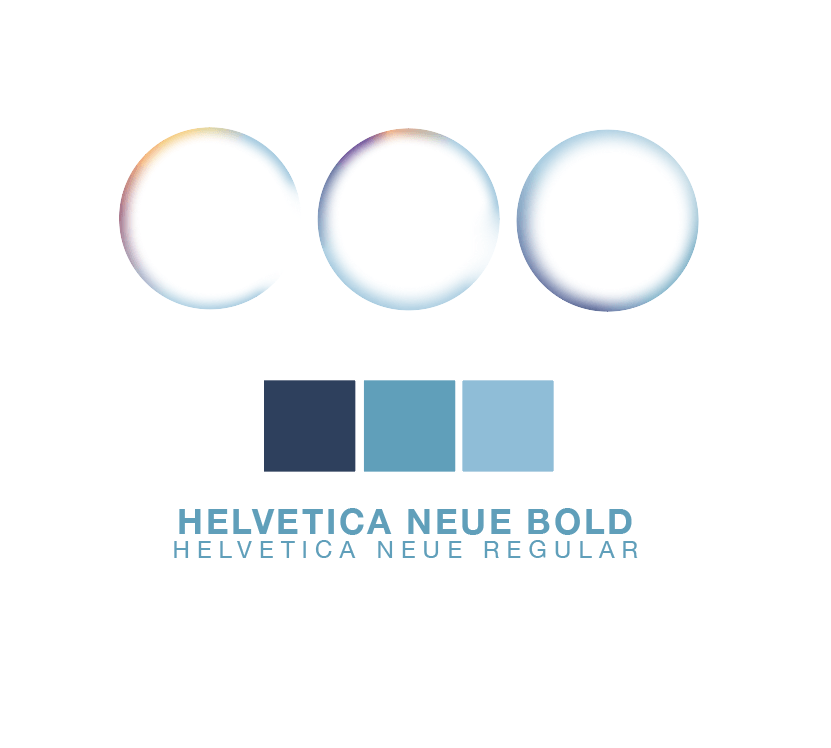
Susan loved it. And I love it too!
My critique of drafts 1 & 2
It’s great to look at the progression of a logo’s design. Even if Susan had liked the first or second draft, it certainly wouldn’t be the final version of that concept. Spacing, alignment, color, size, these can always be improved upon to give it a polished look.
Draft 1
- The colors are far too purple and girly. I probably would have toned down the brightness and honed in on just a few accent colors in the bubbles, similar to how I did in the final.
- I like the idea of a script. The problem with a script, however, is that it is VERY difficult to read. Scripts are great for wedding invitations. Logos? Not so much. If Susan had liked the idea of a script, I would have tried to find something that still had a handwritten look but was less angled with more definition to each letter.
Draft 2
- I am just overall not a fan of this font: Mostra Nuova. No thank you. I’d probably try to adjust this font to make it a bit more unique, play with spacing, sizing, and thickness.
- Eliminate the dark blue (that almost looks black) in the bubbles to lighten them up. I’d also probably eliminate a few and adjust the sizing and location.
What do you think?
Overall, I am very pleased with this process considering it was a holiday week and we had just 2 days to pull off a logo design that we both love.
Can I tempt you into taking the next step?
Every logo situation is unique. You might have all the time in the world (not 2 days); know exactly what you want or be open to suggestions.
When you work with Harford Designs, you can rest assured that I’m treating your logo and brand with care.
Let’s take the first steps to upgrade your logo. Together.
