The perfect logo design can be tricky to pin down. Beyond the colors, fonts & typography, words, and imagery, it needs to connect with the clientele you aim to serve.
When it comes to building a successful brand, the appearance of quality is just as important as the quality itself. Customers often judge a brand based on its appearance, and if it looks cheap, it can be difficult to gain and maintain customer trust.
In this article, we’ll explore several factors contributing to a brand that appears cheap that immediately send your potential clients to the competition.
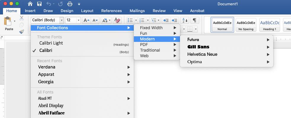
1. The typography is straight from Microsoft Word!
If a brand’s products or services are of poor quality, it can give the impression that the brand is not committed to providing value to its customers.
If you’ve decided to dabble in logo design without the appropriate tools (Adobe Creative Suite), you’ve most likely used one of the more “adventurous” fonts from Microsoft Suite.
Unless you’re trying to acquire Gen Z or the future Gen Alpha, your audience has likely grown up with keyboard classes since the first grade and played with these cool fonts themselves. They can recognize them in an instant and aren’t impressed.
2. You commissioned an artist for less than $100 to design it on fiverr.com
If a brand’s visual identity, including its logo, website, and marketing materials, looks cheap or unprofessional, it can give the impression that the brand is not worth investing in.
Working with a designer who can turn around a logo within 24 hours without doing the market analysis or research delivers a design that may look pretty on the surface will leave your target market wondering if they’ve seen something similar.
You get what you pay for on this freelance design platform.
- 1 version
- Three revisions
- PNG file
- No original vector files
- No brand study
Mason Weis from Medium.com may have said it best when he summarized,
“Logos shouldn’t be sold for $5. This is beyond way too low. A logo shouldn’t be as cheap as a sandwich.”
Despite showing off their “best work,” with prices so low, don’t anticipate receiving high-quality work.
3. Unclear messaging—trying to represent too much in the logo.
Logos should be crisp and memorable, represent the brand, and be easily recognized. Bad logos confuse with over-complexity, merging ideas that just don’t fit or trying to convey too much information at once.
If a brand’s messaging is unclear or conflicting, it can make the brand appear unreliable or untrustworthy.
Whether logo mark or text, compelling logos are often straightforward.
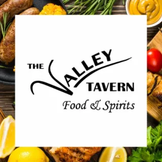
4. You’ve affiliated your business with a city or state and took the affiliation too literally.
I’m specifically looking at you for this one, Maryland.
Marylanders love the state flag, and if given a chance, many realtors, contractors, or local businesses will try to incorporate the 4-colored flag into their business branding.
While state pride is admirable, the additional detail of the flag overcomplicates your identity.
According to the Maryland Secretary of State, you should submit a form describing the flag’s intended use.
“Describe in full detail the intended use of the Maryland State Flag (attach depiction or drawing), including whether it will be used on a product or product package, or to advertise or promote the sale of a product or service, and whether it will be altered or have any other words or design on or near it.”
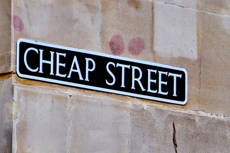
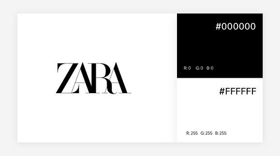
5. Your colors clash and are challenging on the eyes.
Whether colorful or muted, not every color is as legible as black and white.
Too many light colors without a strong contrast will have your prospects squinting as if looking at the sun. The same can be said for dark colors.
Neons bring back 80s and 90s vibes, and while the nostalgia is initially exciting for Millenials, the colors do not age well.
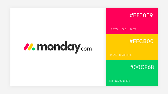
While your brand may have various color choices, most designers advise that a logo feature at most three colors.
Build a lasting impression
When launching your practice or firm, ensure the competition and your ideal market understand that you mean business! Professionalism & branding set the tone of your company. Embrace it with a designer dedicated to your success.
Schedule a meeting today and let us help your business stand ahead of the curve.
Just for fun—an SNL classic for designers!