
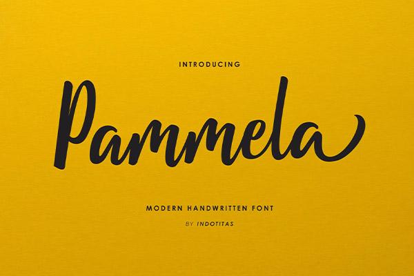
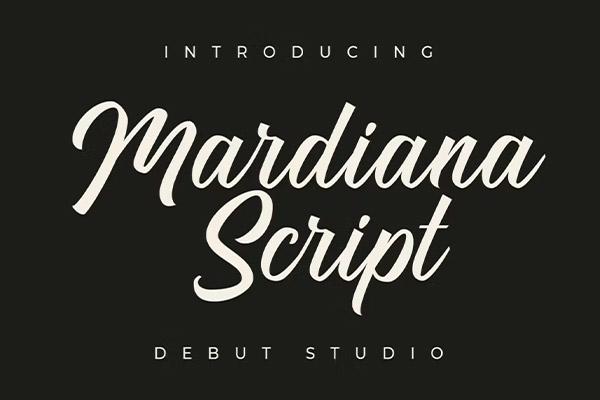
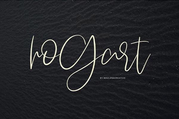
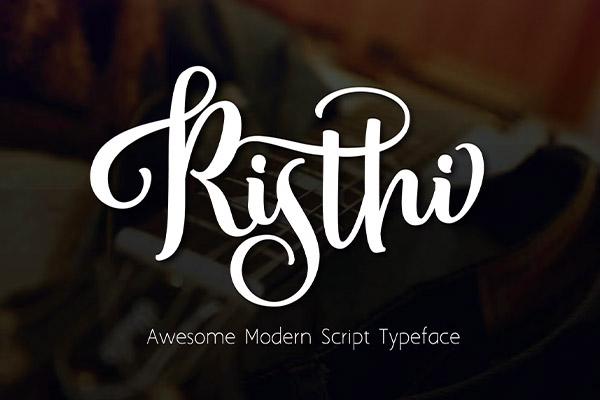
Avoid script fonts at all costs. Period. End of discussion. Unless you’re a bridal boutique, these fanciful loopy loops belong nowhere near your financial or professional services business.
Sure… scripts, calligraphy, cursive—whatever you like to call them—can seem elegant and fun. However, they are not easy on the eyes in terms of legibility. All the swishes and oversized ligatures can become difficult to follow—especially when you are writing more than one line of text. And while they are decorative and so so pretty, they aren’t practical.
Considering many schools in the USA have removed cursive from their curriculum, you can imagine the additional strain it will be for the younger generations to read your thought-provoking copy.
If scripts are part of your brand, consider employing them on your website as a header only. It’s much easier to read “About Us” than it is to read an entire bio in a script.
Employing a traditional serif (think Times New Roman, Georgia) for the headers and a San Serif (Arial, Verdana) for the text may still be beneficial.
Avoid all caps
Fonts.com might say it best.
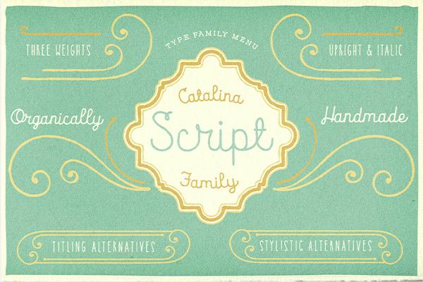
Most scripts have capitals that are decorative and ornamental; they are designed to work well with lowercase letters, not other caps. For this reason, most scripts should not be set in all caps as this can render them unreadable and is considered amateurish.
Consider font/point size
What looks sophisticated at 44 or 36 point might look crowded and hard to read at 16 or 18 point. Consider the size range you will be setting your font to ensure it works well and will print successfully at all those sizes.
Selective Use
Consider the context in which you’ve decided to utilize the typeface. A quote from Steve Jobs, for example, certainly deserves more than Curlz to emphasize a meaningful phrase.

Reserve your script for something significant, like a call to action. Channel those “Save the Date” vibes into a “Schedule a Meeting Today” to formally bring your reader to the next step of the process.
Choose a script font that is clean and easy to read.
Another significant factor to consider is the industry in which your business operates and your target audience. Calligraphy doesn’t make sense for a medical practice, a lawyer’s office, an investment firm, etc.
Script is not fitting for every industry. Consider how it would reflect your business to your reader.
Make sure the script is big, bold, and easy to read. Keep the subheader, lead-in paragraphs, and buttons in a simple serif or san serif. Feel free to center these elements to imitate a formal invitation.
Alignment
Speaking of centering, if you absolutely must use a script for your paragraph font, never center align that paragraph. If you decide to ignore everything I’ve told you so far, please, please, please do not center align your script unless it is a header. While the script itself is difficult to read, following line-to-line is equally challenging. At this point, you’ve completely lost your reader.
Script can be difficult to read all on its own. Remember that alignment, spacing, and general layout influence whether the reader stays or goes.
Conclusion
If you walk away from this article with any doubts about scripts, ask yourself this one question:
Is your company a boutique, bridal shop or service, women’s coaching service, food-related, news source, or a children’s education business?
If you answered no, it’s time to consider a rebrand.