Rebranding a large company can be challenging, especially when there are innumerable internal structures, departments, board members, and directors with conflicting schedules and motives. Fortunately, for local or regional firms, a rebrand is not as daunting.
When branding for your advisory or lending firm, your logo can be one of the most recognizable aspects of your business (after your reputation of course). It plays an integral role in business identity and your marketing strategy. Therefore, your logo should always appeal to current and potential customers in your niche market.
As your financial business designer, Harford Designs helps evolve your messaging—perhaps after a change of owners or leadership, a merger, a shift in expertise, or regional expansion—to capture the audience you connect with the most and really, really want as clients. We help you deliver new energy through graphics and website design to match your company’s values.
Having worked in the financial realm of design and publishing since 2011, we are ready to walk you through the signs that it’s time to update your business logo.
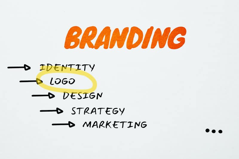
Signs it’s Time to Upgrade Your Logo
Here are some telltale signs that it’s time to upgrade your logo:
1. You Initially Designed the Logo Yourself
One of the biggest mistakes we see in a financial branding design is too much “DIY” or something created cheaply by some nameless guy on Fiverr.
Many new entrepreneurs try to keep costs down at the beginning of their business by tackling design tasks themselves, without having completed a brand analysis. The design simply “looks good.”
While there are many things you can DIY in business, logo design is not one of them.
After Fiverr, there are various online apps for free or at a very low cost that say they can help but, unfortunately, all look very rubber-stamped with intersecting abstract shapes.
These apps don’t measure up to the tools and expertise that a professional designer can offer—which includes developing a brand message and creating a marketing strategy for your niche. A professional aims to eliminate the repetition in design elements that distinguish you from your competition.
Not only can a professional create a high-quality design, but we understand the nuances of your financial marketing to design a logo that will grab your ideal client’s attention.
2. Trouble Differentiating the Brand—Your Logo Looks Similar to Others
In a crowded market, it can be difficult for businesses to differentiate their brand and stand out from the competition. If your logo looks too generic, it is unlikely that people will identify and associate it with your brand.
A unique logo will be memorable and ensure that your business stands out among the other financial companies in your area and online.
Often, app or website logo creator tools use the same templates with similar visual elements, which makes the elements bound to repeat. Or the logo is too literal and becomes cliche.
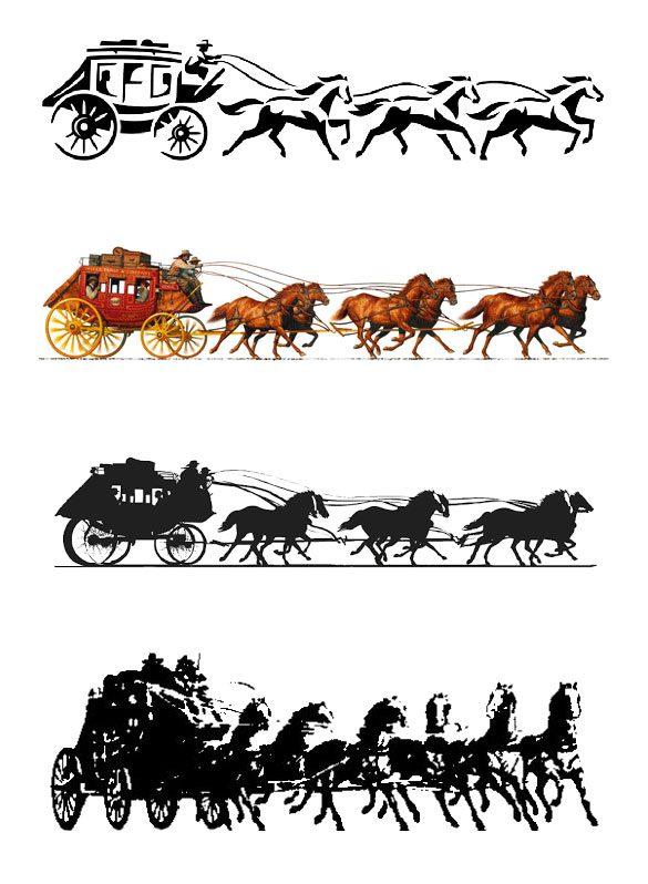
3. Your Logo is Too Complicated
People generally want to identify with things that are simple, clean, and attractive. They are subconscious elements your high-net-worth clientele will naturally gravitate towards.
If your logo is too complicated for your lending or consulting firm, consider updating it to be less involved and more memorable. Remember: less is best.
Additionally, keep in mind how the tiny details of your logo will look on-screen or printed, when small and enlarged. If you have to blow up a logo to see the nuances of an intricate design, it’s time to update.
4. Your Brand (and Content) Are Dated
Basic typefaces, poor colors, dated imagery. Depending on the technology used to create a logo, it is probable that the logo did not age well.
If your logo was created 10, 20, or even 30 years ago, now may be the right time to give it an energizing face-lift. A subtle reimagination of your current logo with the latest graphic design software may be all you need to breathe new life into an otherwise established brand!
There are several indicators that a brand may be dated:
- Outdated design elements: If a brand’s visual identity, including its color scheme and typography, feels outdated or no longer reflects its values or target audience, it may be time to refresh.
- Poor customer experience: A brand’s customer experience, including its website, customer service, and in-store experience, can become dated over time. If a brand’s customer experience is not meeting the expectations of its target audience, it may be seen as outdated.
- Negative reputation: A brand’s reputation can also be an indicator of its perceived relevance. If a brand has a negative reputation due to negative reviews, customer complaints, or crises, it may be seen as dated or out of touch with its customers.
- Lack of innovation: If a brand is not introducing new products or services, or updating its existing offerings, it may be perceived as stagnant and not keeping pace with the industry.
5. Your Logo Does Not Accurately Represent Your Brand
Your logo, colors, choice of typography, iconography, and imagery should communicate your brand in a single glance.
If you feel that your original imagery no longer does that, an update is necessary. Be sure to communicate your intentions with your designer–describe your previous values, mission, and audience, and then elaborate on your new—or updated—brand.
Your brand is allowed to evolve. A modern logo can communicate that a brand is evolving and staying updated with industry trends and customer preferences.
6. Your Logo Does Not Look Great Across Different Devices
Depending on when and how your logo was designed, it may not be suitable for certain devices today.
For example, in the past, logos were formatted for desktop computers and printers. Today, those old .jpg or .png logos might not translate well to smartphones and tablets without the original design files that seem to magnify the slightest pixelation.
Remember that most people access the internet through their cell phones. If you see pixelation of your logo on mobile devices, go for an update immediately. Your logo must look clean and crisp across all devices for the tech-savvy clients you’re trying to attract.
7. Your Logo Lacks Relevance
A brand may be seen as dated if it is no longer relevant to its target audience or the industry in which it operates. For example, if a brand’s messaging or marketing efforts are not in line with current trends or customer preferences, it may be perceived as out of touch.
Updating your logo makes your financial business more appealing to a fresh audience who may not want to use “dad’s advisor.”
After updating, consider throwing a “relaunch” or “rebrand” party to invite previous and current clients and encourage them to bring business acquaintances for networking. This is a huge opportunity to reaffirm your commitment to your clients—in person!
Post the event on social media and contact local news outlets to create buzz. Press releases are never discouraged!
8. You Have Recently Changed Your Business Model or Strategy
If you change your business model or strategy, it may be necessary to update your logo, too.
A brand’s reputation can also be an indicator of its perceived relevance. If a brand has a negative reputation due to negative reviews, customer complaints, or crises, it may be seen as dated or out of touch with its customers. A rebrand can sometimes hit the “refresh button” on clients and bring new, revived energy to the company.
Knowing when it is time to refresh your logo can make all the difference for your financial business.
Harford Designs Business Logos
A logo is a visual symbol that represents a company or organization. It is often the first thing that potential customers or clients see, and it can make a lasting impression.
Harford Designs is a financial branding agency that can help get your business on track for success, starting with your brand and logo, website, and marketing strategy.
When ready to upgrade your logo, give Harford Designs a call or schedule a consultation!