After a successful branding redesign, Harvest Investment Consultants and Harford Designs teamed up once again to build a dynamic and client-focused website.
The website project focused on several key details:
The ideal client & their demographics
Easy access to client financial reporting portals
Consistency with branding colors and typography
Our Process
In a backward sort of way, our first step was acquiring imagery of the target market—older, established families looking forward to retirement.
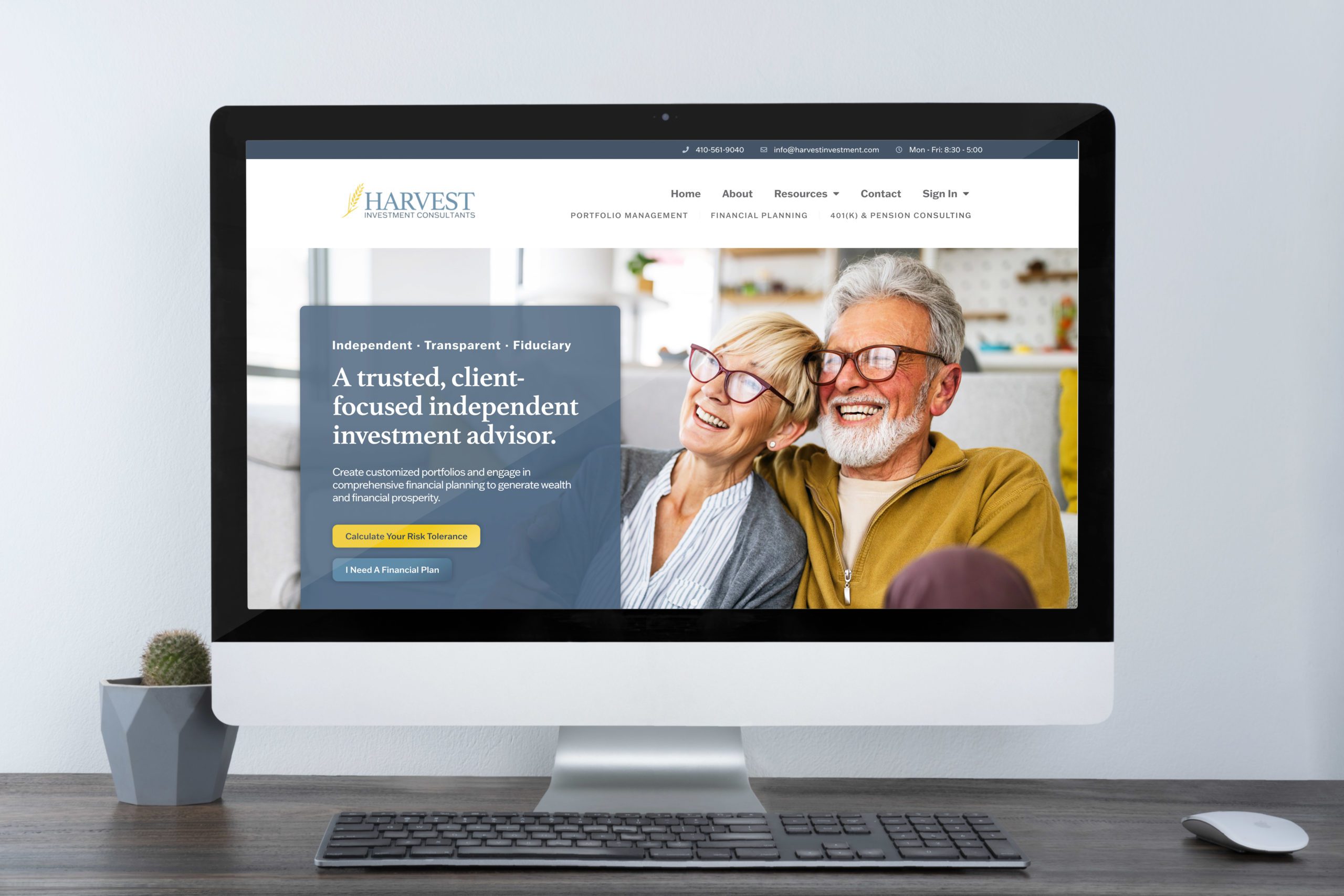
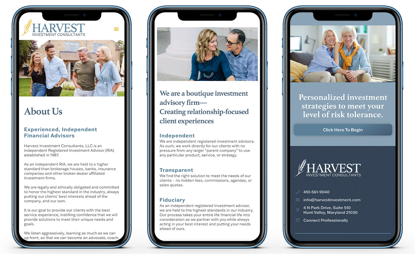
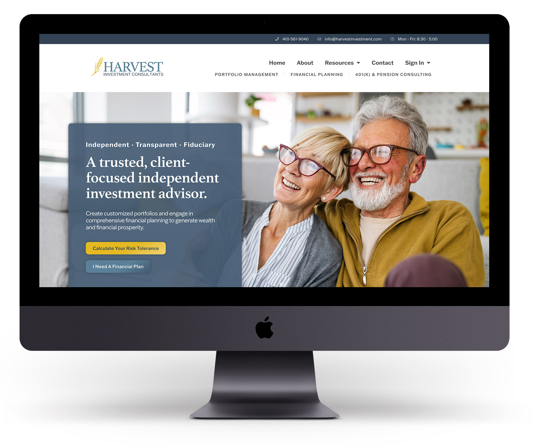
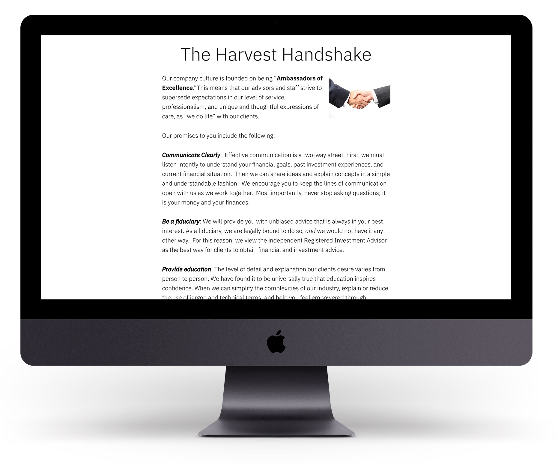
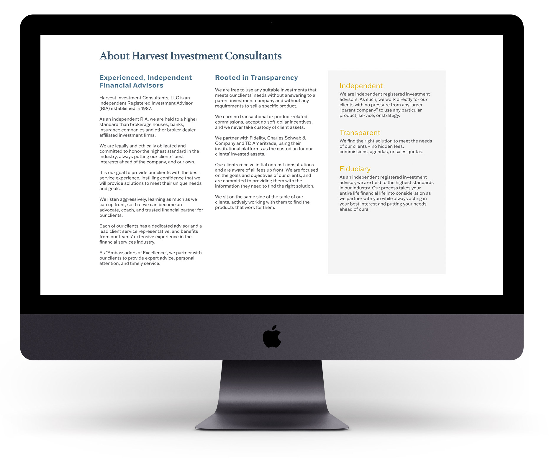
While the homepage is a full-width side, all the internal pages were boxed in (white along the margins) to capture a more established advisory look.
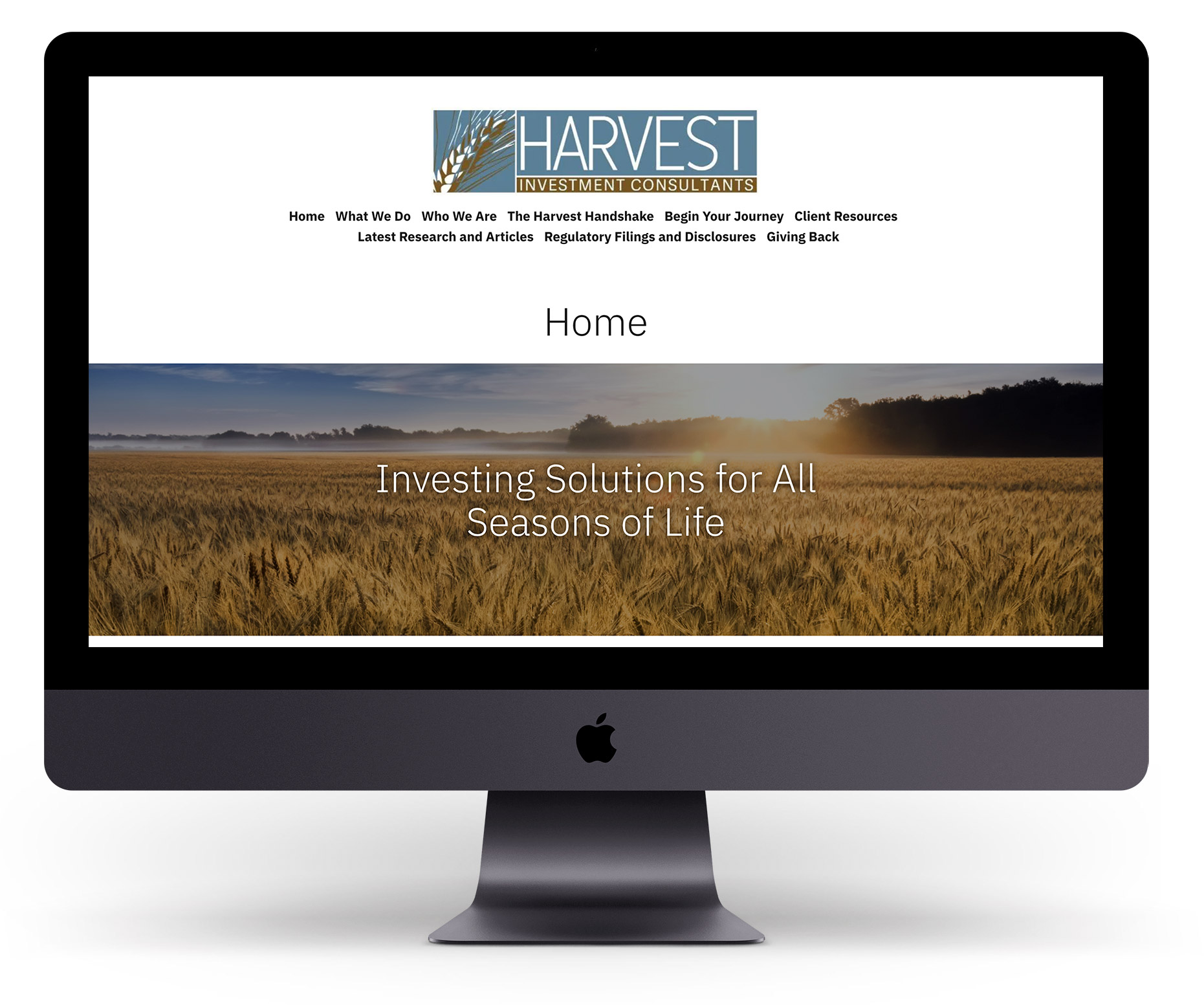
Before — Home Page
After — Home Page
Before — About Page
After — About Page
Color Palette
Davys Grey
Black Coral
Slate Gray
Saffron
Orange Yellow Crayola
Final Results
Immediate results!
In a post-launch follow-up call, owner Mike Meily declared that the site had brought in three viable leads and converted them to clients—something their old website has never done.
Moreover, these new clients specifically stated the professionalism of the website in their decision to work with this financial advisory firm.
Congratulations, Harvest!
WordPress
Elementor
CloudwaYs
Yoast SEO
Client Portals
“
Working with Jessica and her team at Harford Designs, LLC to rework our company branding and website was a great experience.
Jessica does quality work, is detailed, and creative, and really helped us get to final products that we could be proud having our clients and potential clients see.
We’ve created a lasting team-like relationship to keep things in top notch order going forward.