When Harvest Investment Consultants and Harford Designs first met, we discussed the creation of a new business card. Harvest asked what we thought of the branding and logo and we were upfront—we thought it could use a little updating.
Before we could start the business card we needed to create a new logo and brand.
In keeping with traditional financial branding, we employed both a serif and san-serif.
We also added more color to the original 2 color palette.
By adding Black Coral to the scheme and replacing the brown with a new Harvest Gold combination we could brighten the brand and add a level of professionalism.
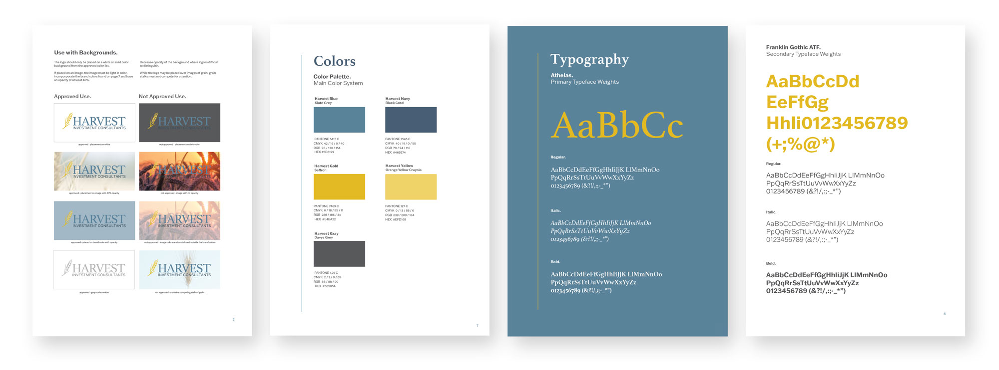
Maintaining the Brand
Some companies send over the logo files and branding stops there.
We wanted to make sure Harvest carried their brand across all their print and digital materials and produced a thorough branding guide that included:
Logo restrictions and approved usage
Color codes for every use, including approved transparencies
Examples of text and how to use color as a call-out
Color Palette
Davys Grey
Black Coral
Slate Gray
Saffron
Orange Yellow Crayola
Branding Guide Sample
Final Results
A Trusted Partnership
Through the creation of a new logo and brand, we’ve built a solid partnership.
We’ve since assisted Harvest in their printing needs—directing them to a large scale, local printing, walking them through paper stock choices and building out additional business collateral.
With the foundation in place, we are on our way to redesigning their website and building something that captures the essence of their brand.
Thank you for your support, Harvest!
“
Jessica helped us rework some branding and our company website. She made the process go smoothly, kept up on track, did amazing work, and we are pleased with both projects. Highly recommend her for the quality of her work, her creativity, and professionalism!!