Sloppy typography is often the first indicator of a DIY website. Putting even a one-page website together is so much more than selecting a font and changing the color to make it stand out.
Here are a few areas to consider when you are designing your first website.
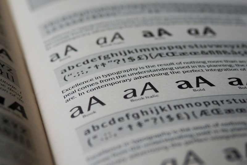
Font Selection
In our professional opinion, a website should have no more than 2 fonts. Seldom 3.
Consider these modern pairings.
Lora Poppins
Josefin Sans Montserrat
Merriweather Open Sans
Hierarchy
Consider hierarchy when it comes to the size of your text as well as the amount of paragraph spacing before and after.
See Harford Designs’ blog post typography settings below.
Heading 1 – Used once on your webpage. It’s the topmost header.
Heading 2 – Secondary header that is assigned to all the sections within your page.
Heading 3 – Tertiary header that may be assigned to a product or service title.
Heading 4 – At this point, you’ve really gone deep into nesting your text.
Heading 5 – I usually leave this for footer titles
Heading 6 – Another header designated for my footers.
Paragraph Text – You know, the primary text you read.
Font Size
Font size on the web will vary significantly from print. While font size 10pt is legible in your Microsoft Word document, 10pt (and even 10px) will make your readers strain. Keep in mind that the web is measured in pixels and there will be a difference in size between points and pixels.
Lorem ipsum dolor sit amet, consectetur adipiscing elit, sed do eiusmod tempor incididunt ut labore et dolore magna aliqua.
Times New Roman – 10pt
Lorem ipsum dolor sit amet, consectetur adipiscing elit, sed do eiusmod tempor incididunt ut labore et dolore magna aliqua.
Arial – 16px
Lorem ipsum dolor sit amet, consectetur adipiscing elit, sed do eiusmod tempor incididunt ut labore et dolore magna aliqua.
Montserrat- 18px
Line Height
Line height, or line spacing, is the space between lines within a paragraph. Not to be confused with paragraph spacing which measures the spacing before and after a paragraph, line-height can significantly affect the user experience in terms of legibility.
Paragraphs with smaller line height are more compact and may be more difficult for a reader to follow; too much and you run into the same issue.
The perfect line height depends on the design and size of the font itself. There is no magic number that works for all text.
Consider the following examples:
Lorem ipsum dolor sit amet, consectetur adipiscing elit, sed do eiusmod tempor incididunt ut labore et dolore magna aliqua.
100% or 1 em line-height
Lorem ipsum dolor sit amet, consectetur adipiscing elit, sed do eiusmod tempor incididunt ut labore et dolore magna aliqua.
150% or 1.5 em line-height
Lorem ipsum dolor sit amet, consectetur adipiscing elit, sed do eiusmod tempor incididunt ut labore et dolore magna aliqua.
200% or 2 em line-height
Paragraph Spacing
Another common afterthought that requires attention. This may be a feature you are familiar with when working within Microsoft Suite.
As a general rule of thumb, headers will be the most likely to require top-spacing. In development or “code”-speak, this can be done using either margin or padding property. It ultimately comes down to preference.
For paragraphs, the bottom spacing on the Harford Designs blog is 15px.