Like any website, nonprofit website trends are always evolving. And creating a great website design can be challenging for even the largest organizations.
Despite the everyday difficulties of managing a website, here are some general guidelines you can follow to ensure that you get the most from your nonprofit’s website, both in terms of engagement and in terms of the donations that keep your organization moving forward.
Website Design and Layout

Your nonprofit’s website layout plays a massive role in how your visitors interact with your organization and when and how they choose to give.
A website needs to be more than just a simple brochure. But it also can’t be overly complicated and filled with endless content—pushing potential donors away with clutter isn’t an option
A Clean, Simple Design
Your website’s design should allow for your organization’s core message to shine. In other words, it should be clean and minimalistic. Only use essential content for each of your pages, and be sure it’s framed with plenty of white space to allow your message to stand on its own.
Simple and clear designers are easier to maintain, meaning you’ll need fewer updates to your website in the long run.
These minimal changes could include:
- Picture swaps
- Announcements/media releases
- Blog posts
- Updates to important numbers
- Changes to personnel
Your website should have clear, simple menus in keeping with the minimalistic approach. It should be easy for your donors to navigate each of your pages to find who your organization is aiding.
Lastly, while images are paramount in communicating your message and story, you mustn’t overuse them. The same goes for fancy design elements that don’t lend to your visual identity—if it doesn’t communicate a specific message about your organization or your mission, toss it.
Donation Considerations

Website donor acquisition is the primary reason your nonprofit’s website exists in the first place. In keeping with a minimalist design approach, donating to your cause should be easily accomplished and prominent in your website’s design.
It’s a good idea to have a donate button located on every page’s header or placed in your main menu. But you’ll also want to include it in strategic locations throughout in the form of a call to action following a compelling piece of content.
A donor shouldn’t have to look for how to give to your organization.
Once a donor is ready to give to your organization, the process should be streamlined and simple. Giving to your organization should be just as easy (or easier) than purchasing from an online retailer.
Written Content and Typography
What you say is paramount to communicating your message to potential donors. But of equal importance is how, precisely, you say it. In this regard, you should be just as meticulous in choosing your website’s typography as you are in its layout.
The typography of a website should be easy to read, clean, and concise. Like your website’s design, less is more in this area. But at the same time, a nonprofit’s typography should communicate empathy, purpose, and professionalism. A tall order for the seemingly innocuous decision of font choices—but it’s an art form that shouldn’t be overlooked.
Moving Imagery
As the saying goes, a picture is worth a thousand words. Images often convey feelings and ideas that words alone cannot. For nonprofits, this is especially true.
While moving images on sliders will reduce your online search ranking, photography can be visceral and have a profound and immediate impact on your visitors.
A great way to accomplish this is to have professional photographs taken of your nonprofit and its events and activities.
Avoid filler images and stock photography at all costs—donors want to see and understand who it is they’re helping.
Instead, show photos of events your organization has held or portraits of individuals you’ve helped. These can be placed in your blog and ABSOLUTELY posted on social media. These make your organization more human and approachable to potential donors.
Video Testimonials

If photography is powerful, imagine how much impact a video testimonial from someone whose life your organization has touched can be. Or to give a tour inside your facility, meet the staff, or explain a process.
It can pay to have a videographer for these memorable shoots, but for those just starting or wanting to experiment with the process, consider a $30-60 ring light to prevent shakey camera hands.
Successful Nonprofit Examples
We’d be remiss if we didn’t offer up examples of amazing nonprofit website design. Here are two, along with a few words on what makes them so amazing.
Upstream International

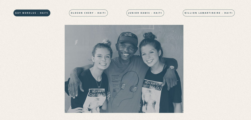
Upstream’s website follows all the principles outlined here. The layout is classic and elegant, with plenty of breathing room around all of the elements. The images are engaging and full of life and emotion. And, of course, it’s perfectly clear how to donate from every page. Their custom iconography is perfect.
![]()
Malala Fund

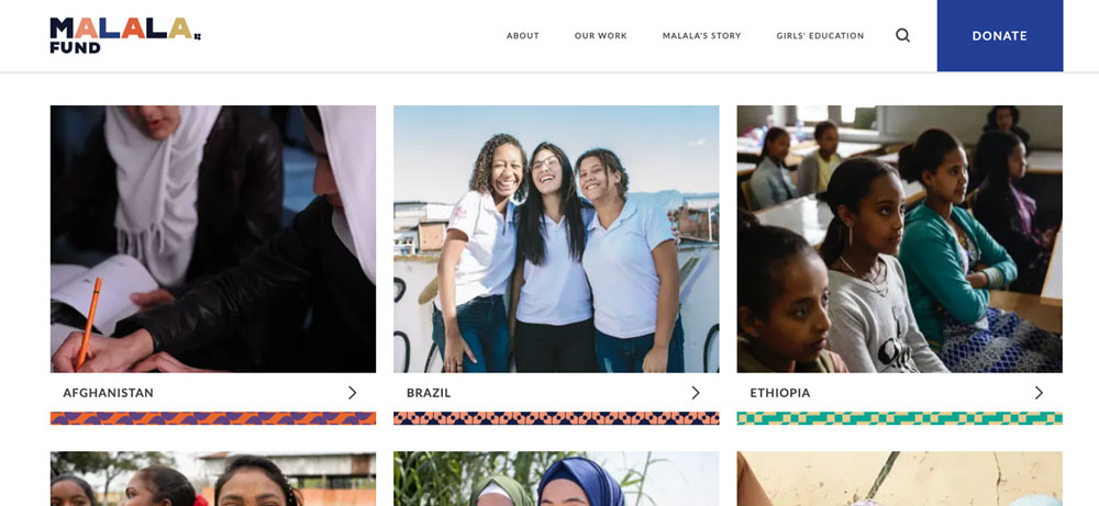
Once again, the donation button is clear on every page on Malala Fund’s website. Their layout is simple, their content is easily digestible, and their menu is easy to navigate—a perfect example of thoughtful design.
Final Thoughts
There’s clearly a lot that goes into the website’s design—plenty of businesses spend tens of thousands to optimize their designs for maximum profits. Unfortunately, as a nonprofit organization, funds are limited, and you need to maximize every cent you spend to push your organization forward.
That said, it’s a good idea to spend as much as you can on a website that’s been designed to communicate your message and visual identity. There are endless organizations—nonprofit and for-profit—competing for everyone’s attention.
To maximize your investment and donations, you need to have a website that stands apart from the crowd and entices your visitors to become donors so that your nonprofit can continue to thrive.


