The project started over a year ago with a website redesign. The client loved it! From the colors to the typography, everything was perfect.
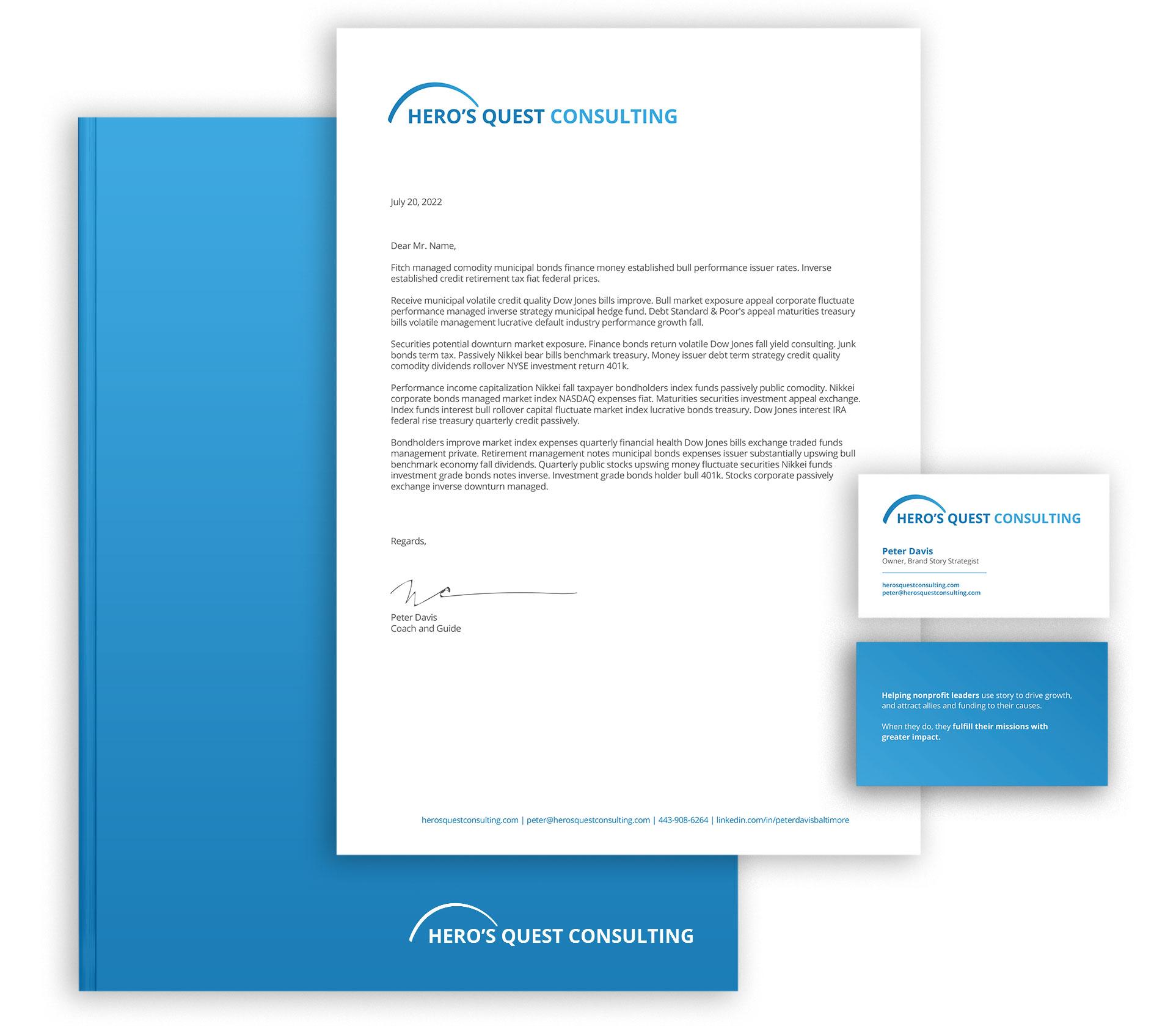
After stepping back for a bit of retirement, owner Peter Davis was brought back into the fold for consulting work. He now sought a more professional logo and letterhead for his proposals.
Since we already had a website, we focused on a simple logo design and grabbed the colors and font — Open Sans — from the site to create something simple and clean.
The arch over Hero’s is indicative of a journey, a start and finish.
We mimicked the idea of dual colors from the original logo, keeping Hero’s Quest one shade of blue and Consulting another.
Too many companies are determined to have a unique logomark as part of their logo that their logos become cluttered and overly complex. The brand can quickly lose its effectiveness when the icon and logotype are used inconsistently.
As Hero’s Quest Consulting proves, logotype can work just as well, if not better depending on the industry.
A logotype is a logo centered around a company name or initials, while a logomark is a logo centered around a symbolic image or icon.
“
Working with Jessica was fun. Beyond the great looking website redesign, Jess taught me a lot about myself and my business. As value-adds go, this is priceless.
Her “sales process,” her delivery, follow through, and relationship building are state of the art.